39,- $
24,- $
or
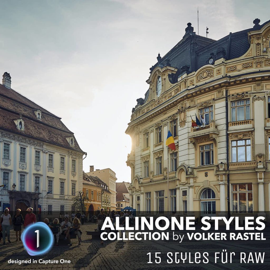
- 15 Styles:
- 7 colored, 4 dramatic, 4 B&W
- 15 Settings:
- Lights, Backs, Grain, …
- 15 RAW Examples:
- for each style an example
- Ready to use download!
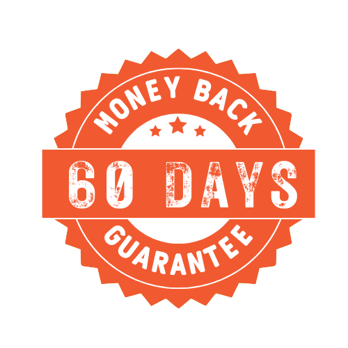
- 60 days money back guarantee
15 effective Capture One Styles for fast RAW development!
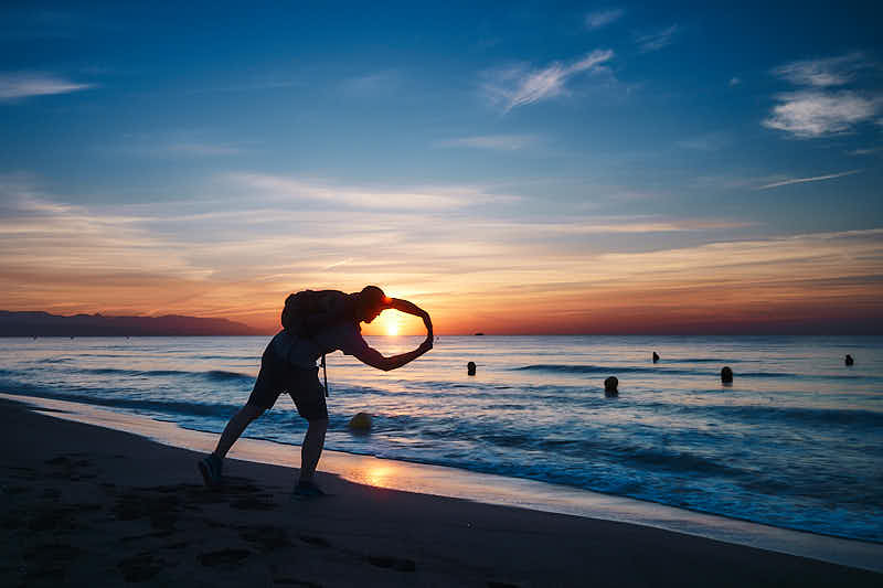
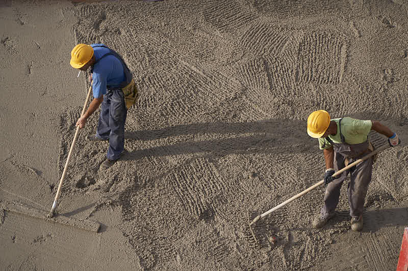
Some styles work for 95%+ of photos, whether landscapes, portraits, architecture, or other photos.
Super fast RAW development of your photos!
The Process:
IMPORT
Import your photos from your SD card into Capture One
AUTO
Let Capture One automatically adjust the imported photos.
STYLE
Tag your photos and add a style that seems to match them best
Sometimes … with just one click!
39,- $
24,- $
or
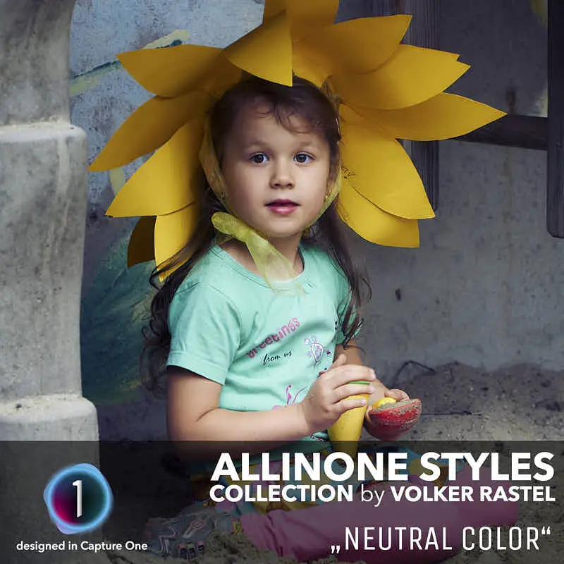
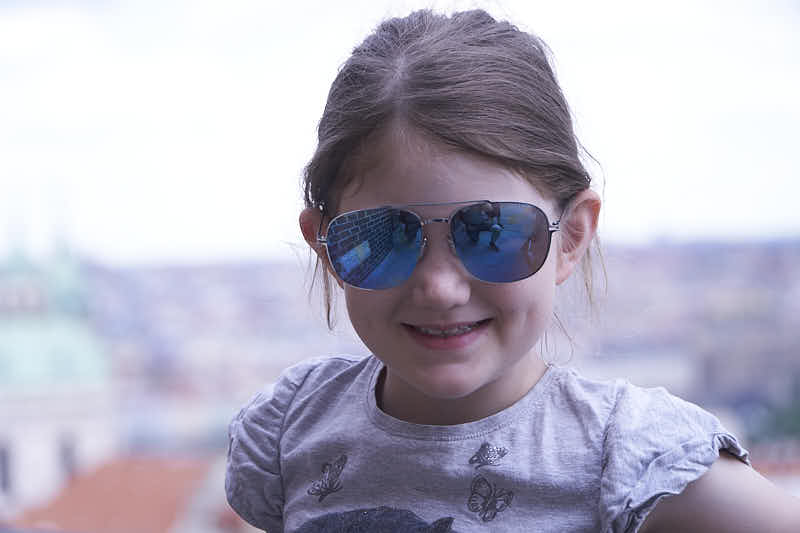
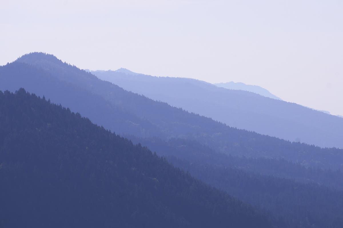
This style is a clean processing of your photos. The colors remain unchanged, providing a neutral look. If really no other style fits your photo then this one is always your choice.
Character: contrasting and neutral
Applicable for: all photos
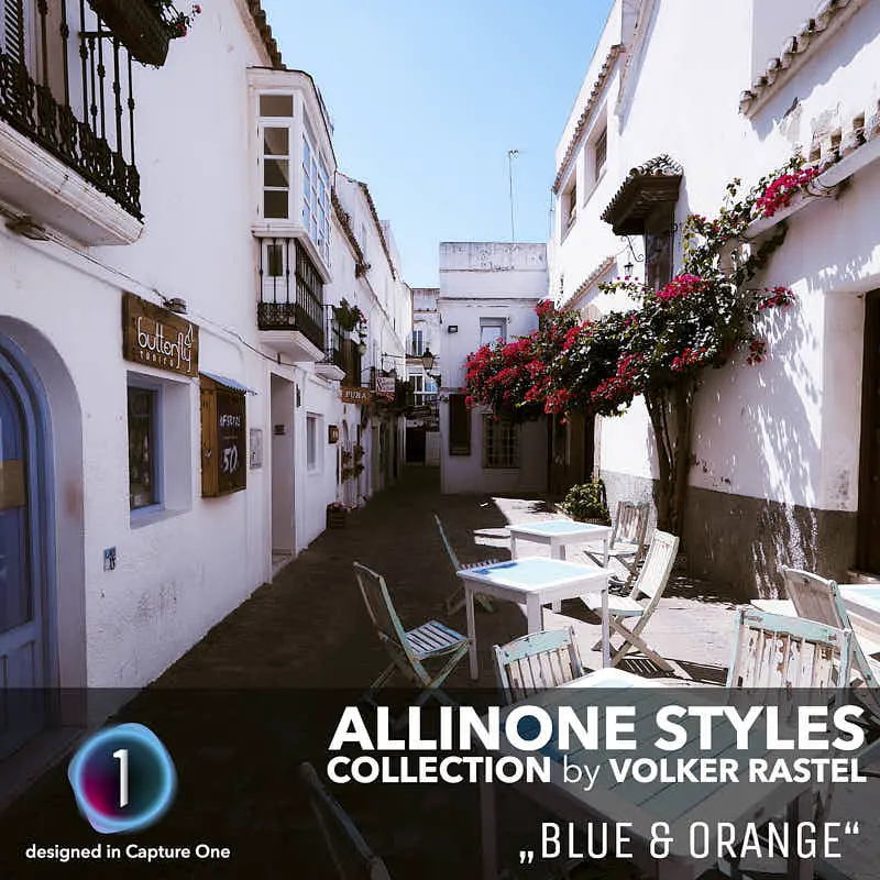
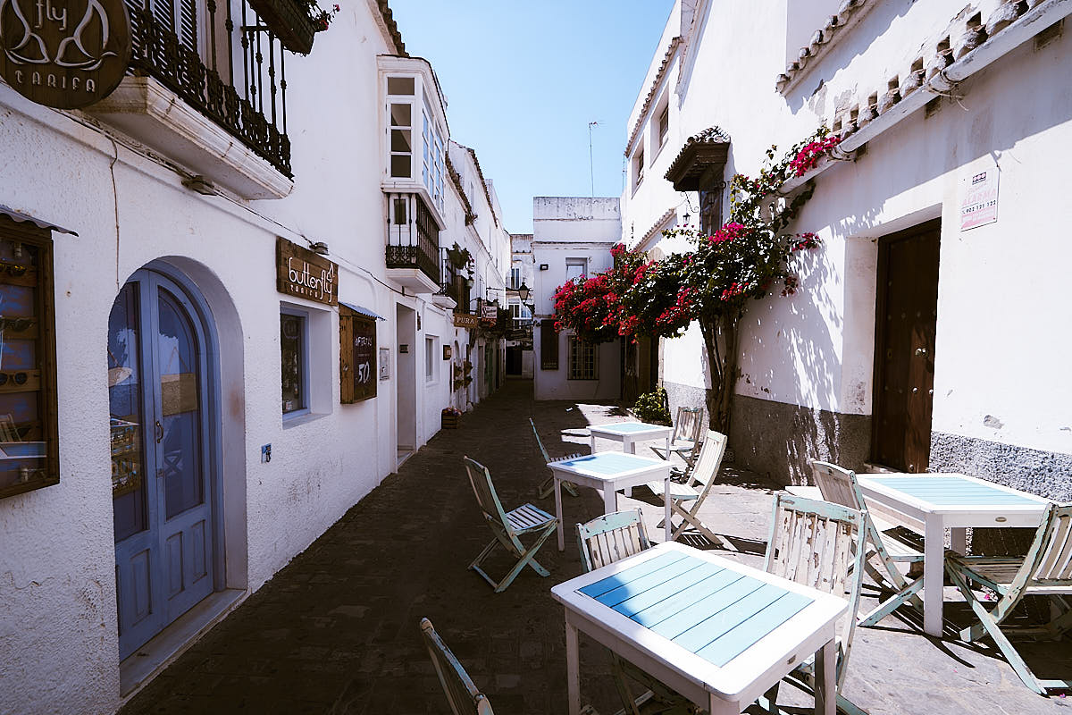
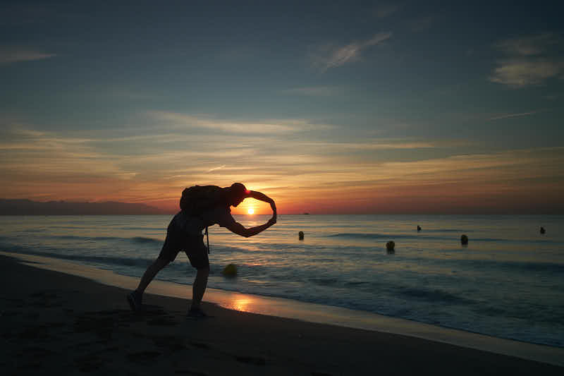
This style gives your photos a cinematic look. Blue and orange are the most famous complementary colors and they perfectly match each other. Many Hollywood movies are edited this way and it is also used in photography.
Character: contrasting and warm
Applicable for: all photos, summer photos
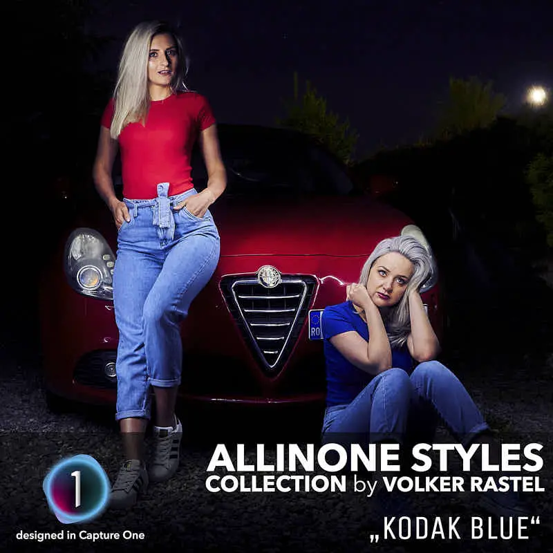
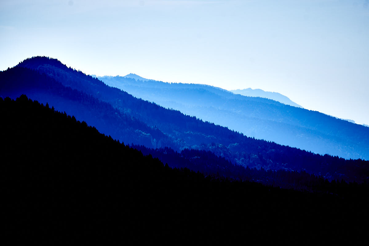
This style pays homage to Kodak Ektachrome, the archetype of today’s slide film. It adds a blue tint to your images, especially in the depths, and makes them look cooler. This is my absolute favorite.
Character: contrasting and cool
Applicable for: all photos
39,- $
24,- $
or
Examples:
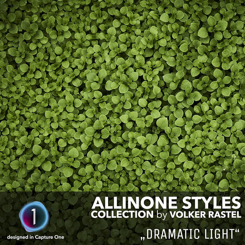
Dramatic images are fascinating. They are exciting and interesting. However, the amount is important, since “overdramatic” does not suit every image. This style is decent and can be used for many images.
Charakter: very contrasty and slightly desaturated
Applicable for: patterns, structures, blue hour
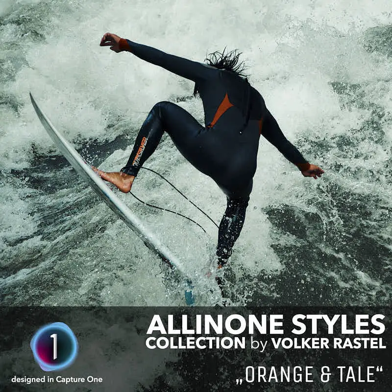
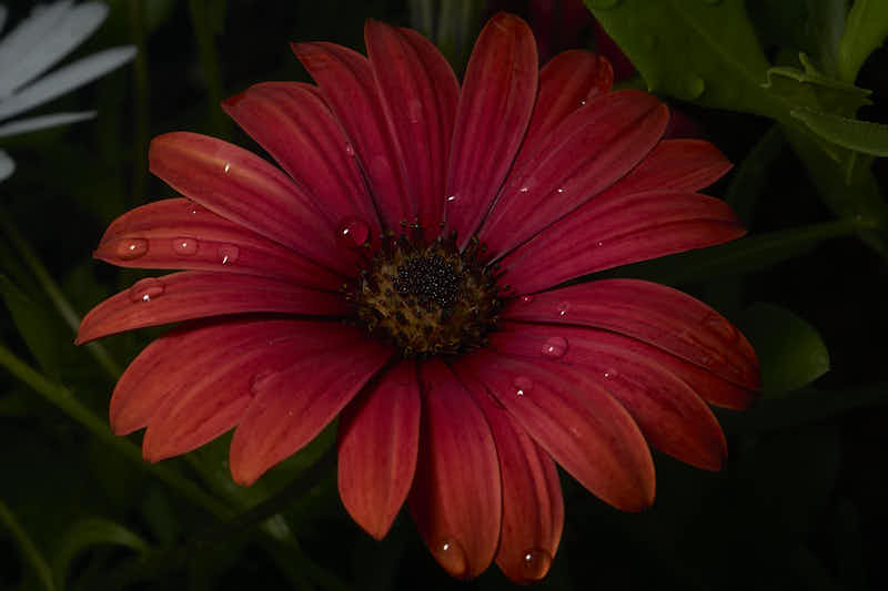
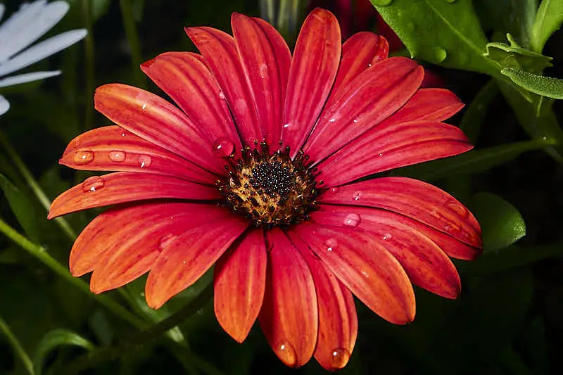
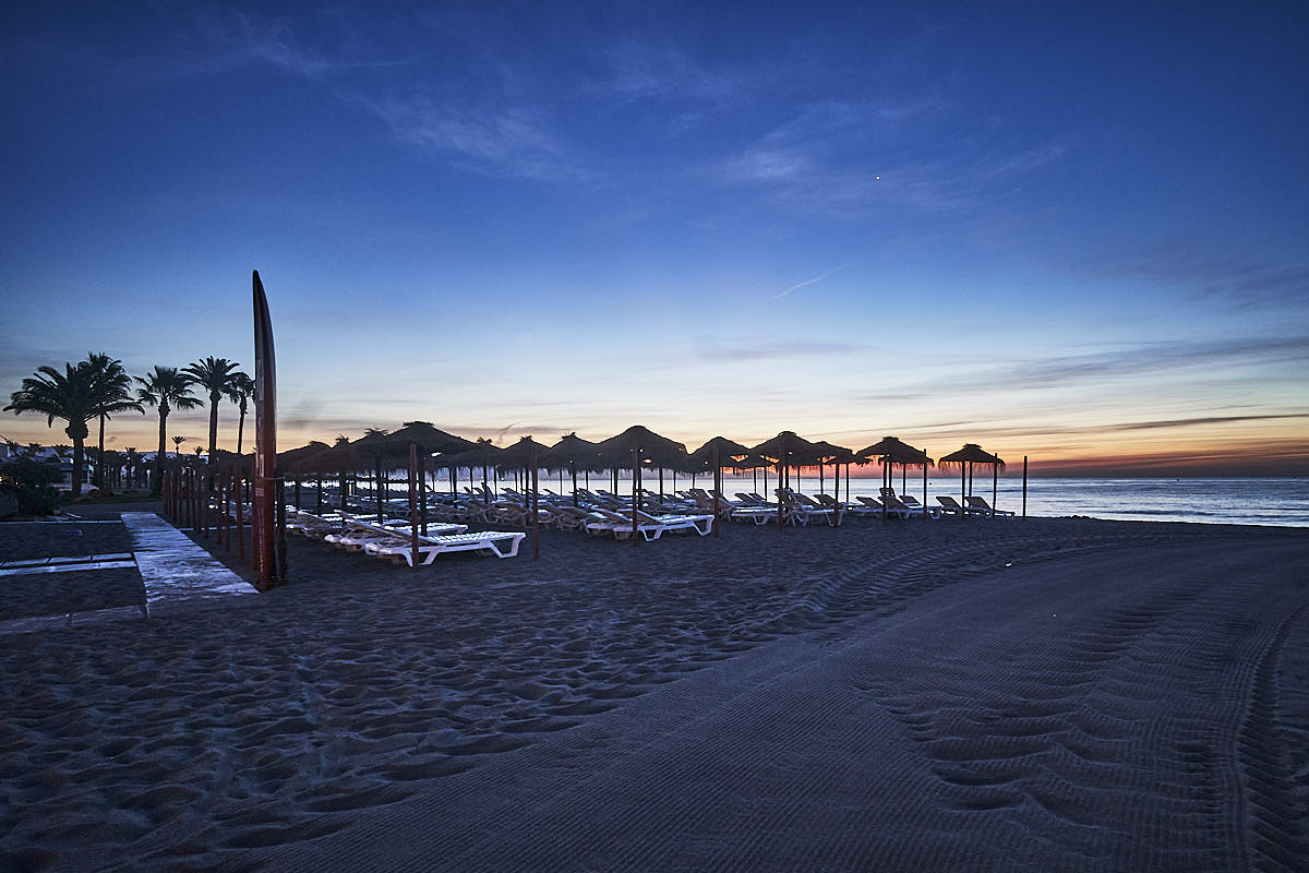
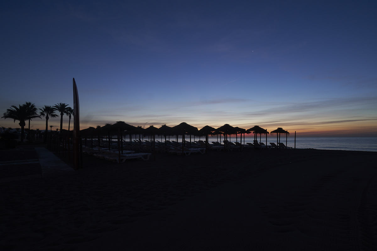
Orange and Tale are absolute summer colors. Dark orange sand dunes and turquoise sea are the best motifs for this style. It does not fit all photos, but it is a summer fairy tale.
Charakter: contrasting and warm
Applicable for: all photos, vacation photos
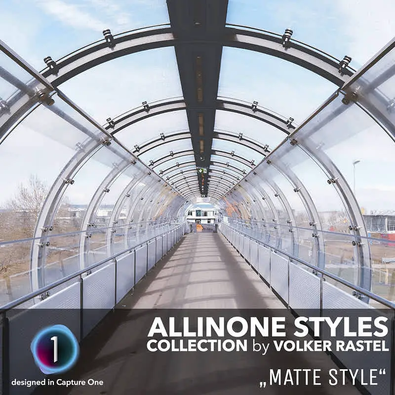
This style gives the photos a retro look. They look like old photos that have been in the photo box for a long time. The colors and the dark areas are slightly faded. Suitable for photos with little dark areas.
Charakter: low contrast and matt
Applicable for: family photos, vacation photos
39,- $
24,- $
or
Examples:
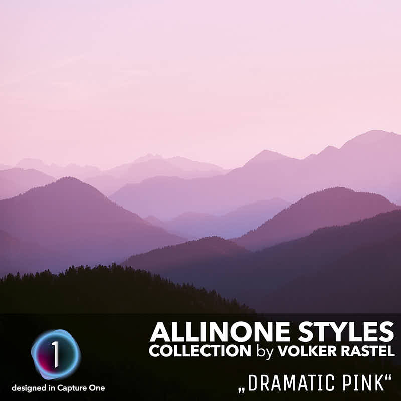
I developed this style for aerial perspectives that should look mystical. But it also fits for abstract photos or graffiti. It is not suitable for portraits or skin pictures
Character: very contrasting and pink
Applicable for: aerial perspectives, abstract photos
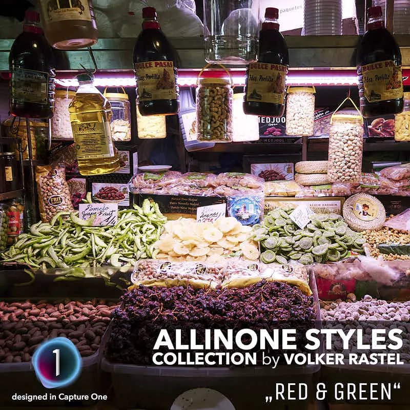
Red and green are two more complementary colors that match each other very well. Red & green motifs are not so easy to find, so it is not so often in use, but when it comes in use then the effect is great.
Character: contrasting and crazy
Applicable for: abstract photos, patterns
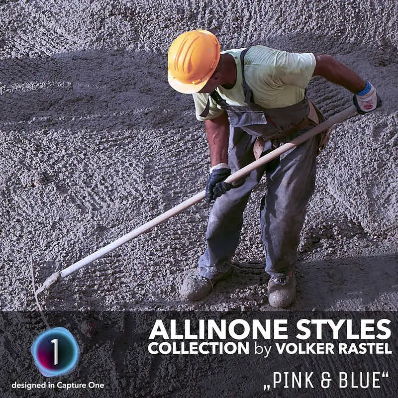
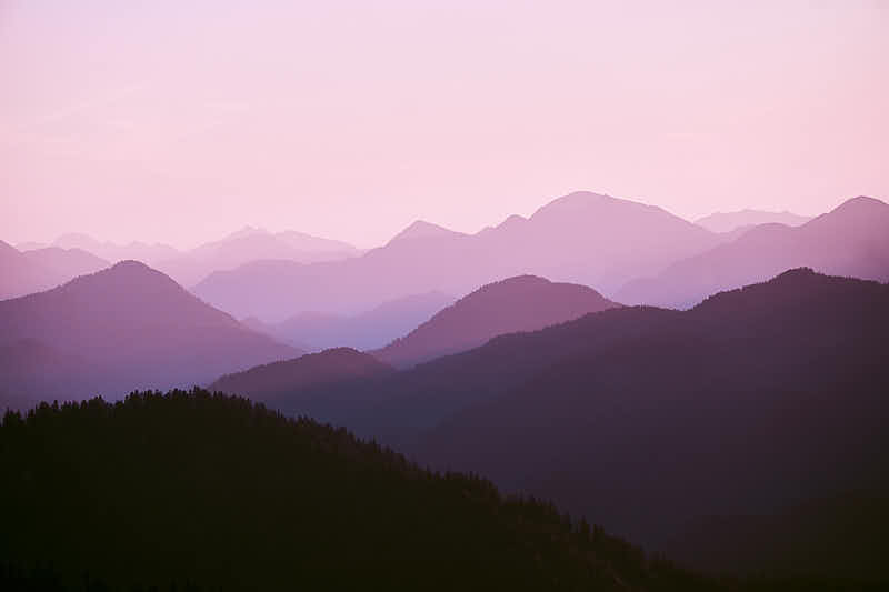
The Pink & Blue style was created a few years ago from a photo taken with my iPhone at the time. It was a RAW image of a sunrise that I more or less accidentally changed to pink during development.
Character: contrasting and cool
Applicable for: Sunrises
39,- $
24,- $
or
Examples:
Hard contrasts, enhanced textures, dramatic scenes and reduced saturation is the slogan for this style. But be careful: if you think this is the maximum, check out the next style!
Charakter: extremely contrast and cool
Applicable for: abstract and dark photos
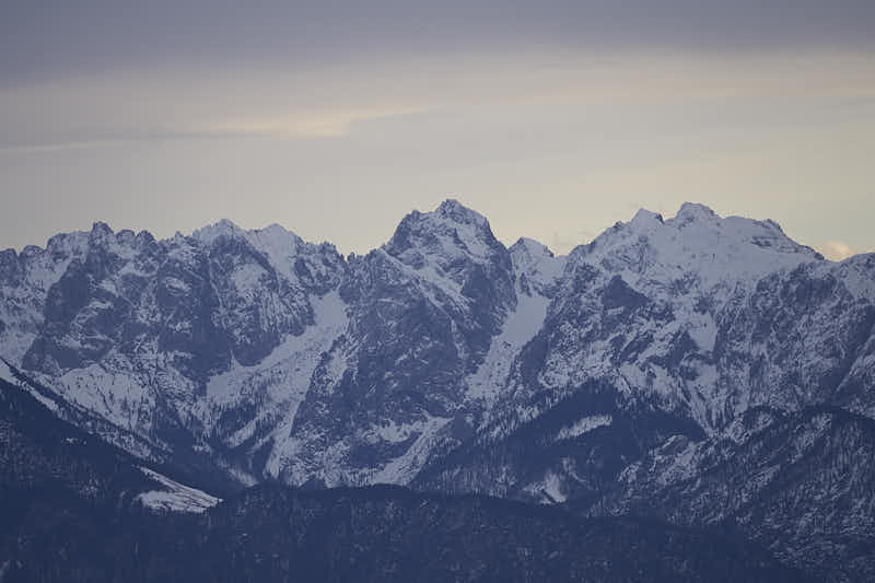
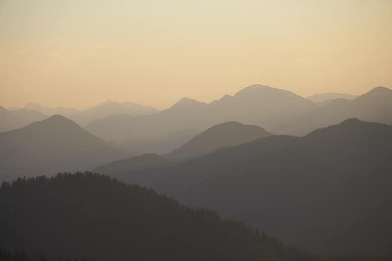
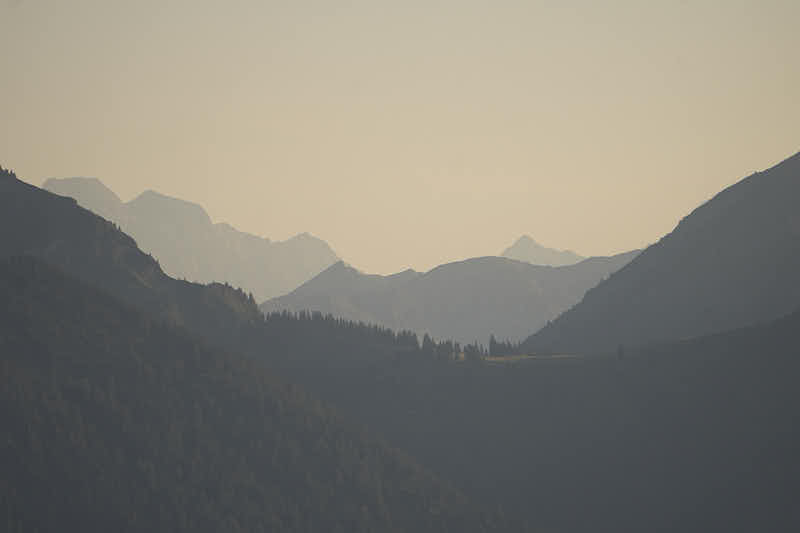
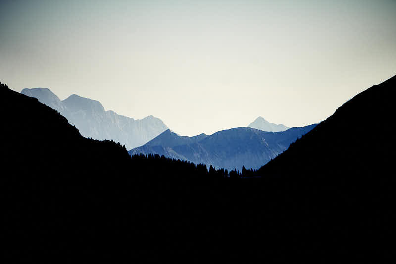
A style exclusively for aerial perspectives that can handle extreme contrast. Aerial perspectives are, for example, mountain ranges that are usually shot with a telephoto lens at sunset.
Charakter: extremely contrast and cool
Applicable for: mountain ranges
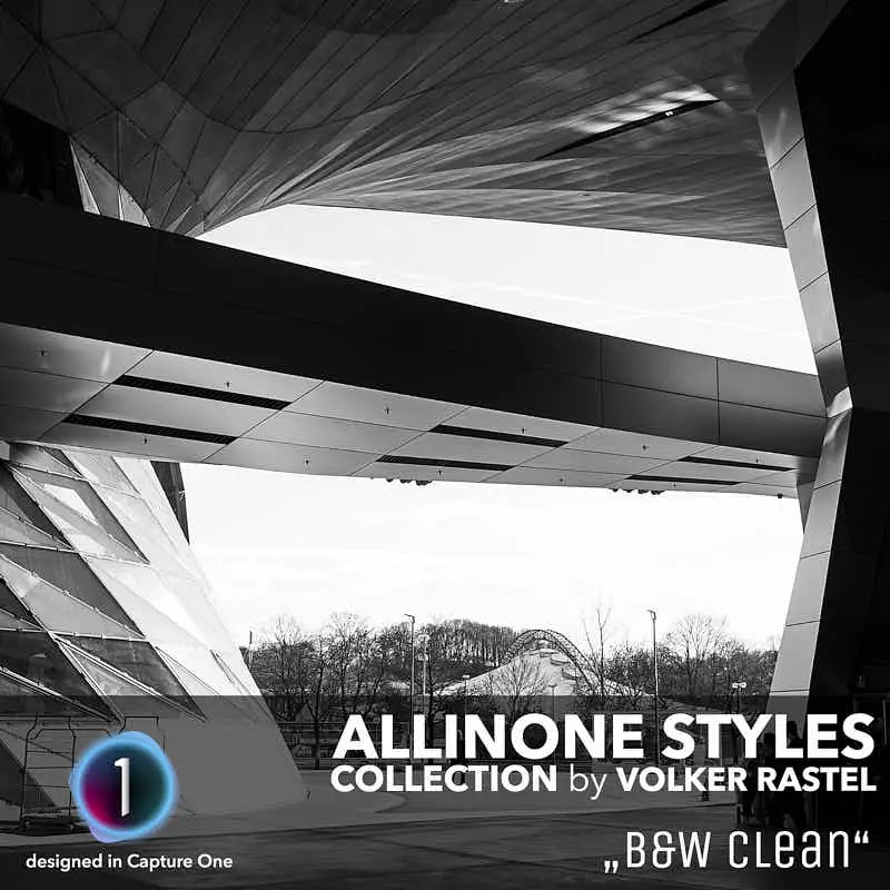
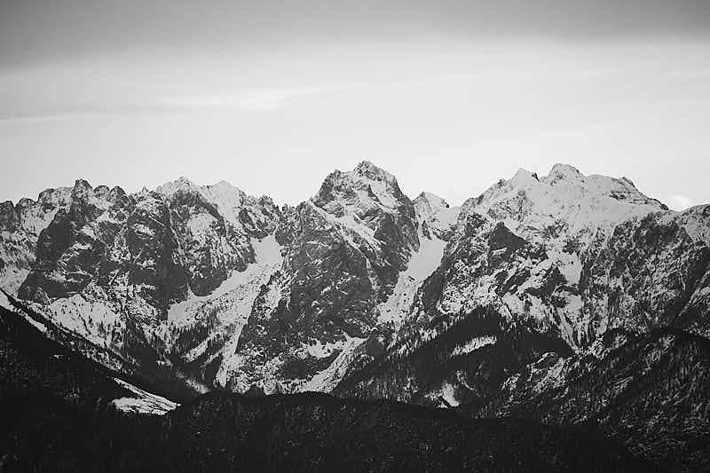
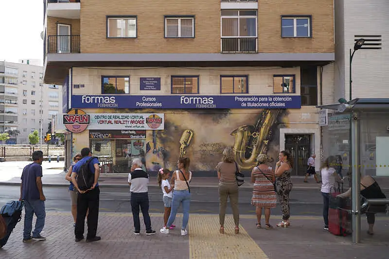
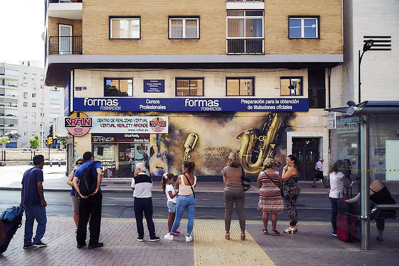
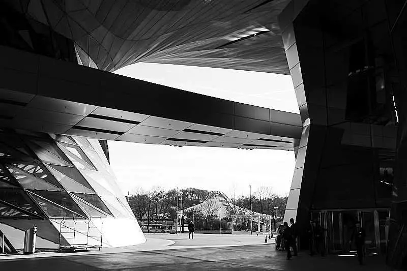
A black and white conversion is not easy. The colors play an important role here. If they are changed in intensity or tonal value, it has a direct effect on the image. This style is pretty neutral.
Charakter: contrast and neutral
Applicable for: Street Photography, Architectures
39,- $
24,- $
or
Examples:
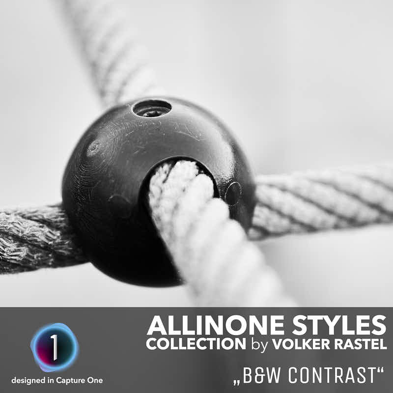
The basis for this style is the “B&W Clear”, but with more contrast and clarity. This creates more drama. Especially images that have few contrasts or similar gray colors are developed better with this style
Character: very contrast and neutral
Applicable for: bright photos
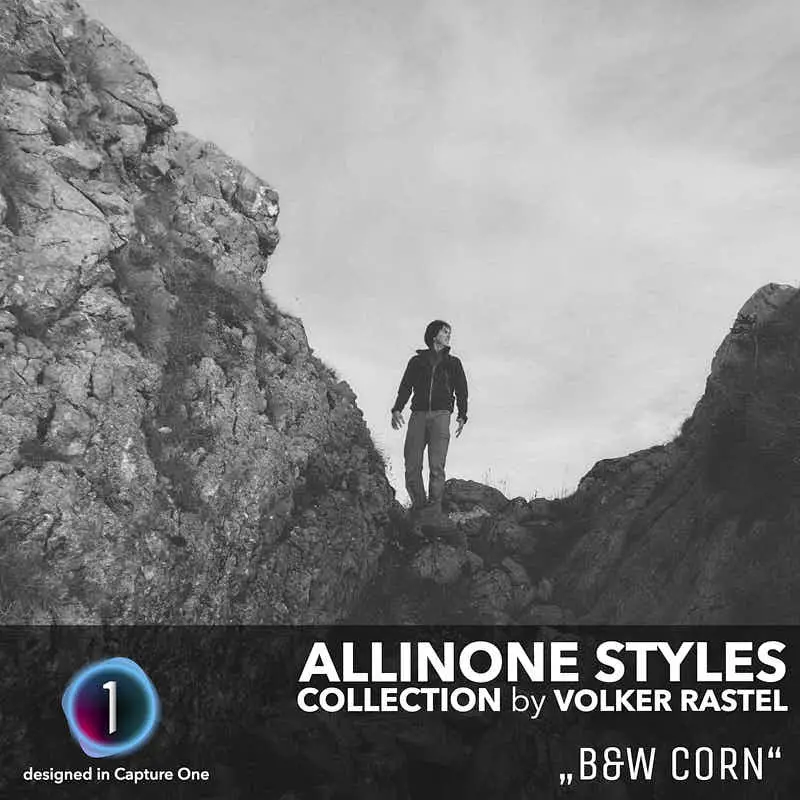
To be honest, I’m more a fan of clear and sharp low-noise photos. But this corn is soft and very decent. It reminds me of my analog photography days
Character: low contrast and corny
Applicable for: memory photos
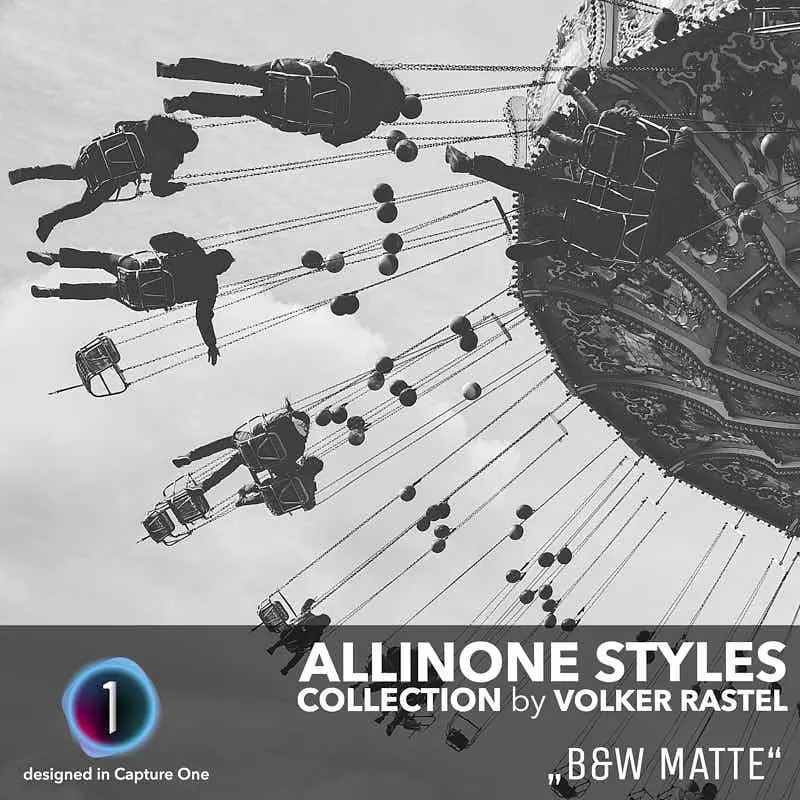
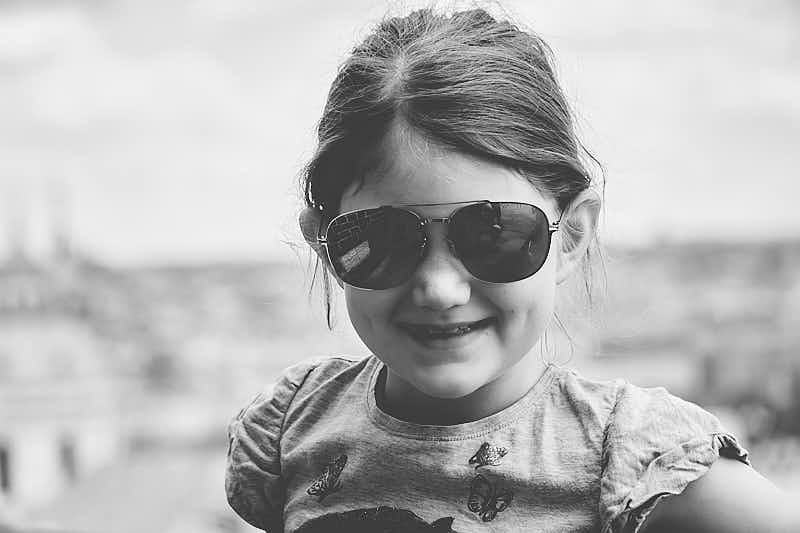
This is my favorite of the B&W styles. It adds a matte style to the photos and makes them look classic but fresh. It is similar to the “Matte Style” but in B&W. It works very well for many photos.
Character: low contrast and matt
Applicable for: most photos


39,- $
24,- $
or
Examples: